

Find Relationships Quickly in Data With Chart::Plot
Last week I was analyzing server log data at work, and my boss asked me to plot it on a scatter chart. “No problem!” I thought, firing up Google Sheets. But Sheets slowed to a crawl when I uploaded 250,000 records to plot. Using CPAN I found something better: Chart::Plot. It has a simple interface and is really fast. Here’s how you use it.
A scatter plot script
#!/usr/bin/env perl
use Chart::Plot;

open my $mlb, '<', '2017-so-hr.csv' or die $!;

my @series;
while (<$mlb>) {
  chomp;
  my ($x, $y) = split /\t/;
  push @series, $x, $y;
}

my $img = Chart::Plot->new(800,640);
$img->setData(\@series, 'Points Noline Blue') or die $img->error;

$img->setGraphOptions (
  vertGraphOffset => 100,
  horGraphOffset  => 75,
  vertAxisLabel   => 'HR',
  horAxisLabel    => 'SO',
  title           => '2017 MLB Strikeouts and Home Runs',
);

open my $fh, '>:raw', '2017-mlb-so-hr.png' or die $!;
print $fh $img->draw();
To demo Chart::Plot, I’ve extracted MLB 2017 pitching data from the Lahman database for strikeouts and home runs given up to see if there’s a relationship between them.
My script opens the csv (which is tab separated) and parses it, pushing the columns into @series. It creates a new 800x640 pixel Chart::Plot object and calls the setData method, passing it an arrayref to @series, and a style string describing the shape and color to plot the series with. Here is the output file:
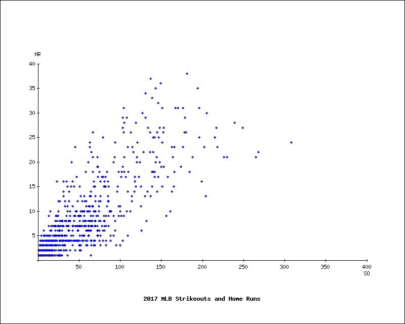
A cursory look at this data would suggest there is a correlation between strikeouts and home runs, maybe hard-throwing pitchers throw more strikes, but the additional velocity gives up more home runs?
Multiple series
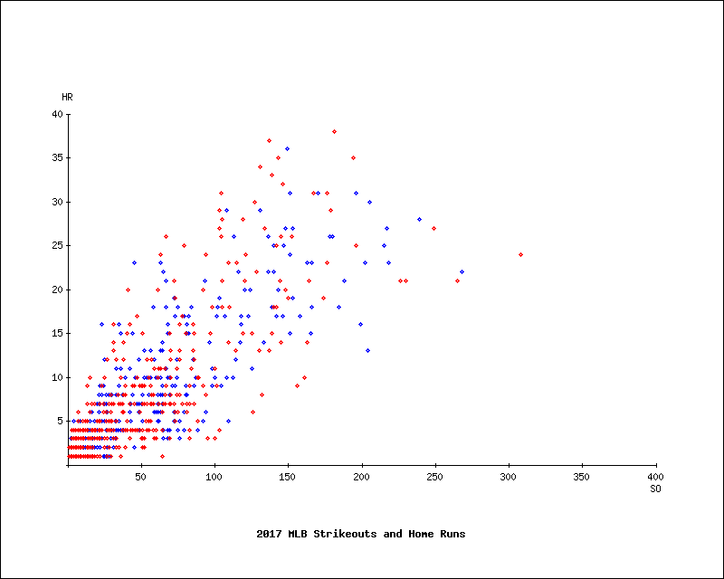
To display multiple series on the chart, simply call setData for each additional series to add. I’ve updated the MLB data to include which league the pitcher was throwing in:
#!/usr/bin/env perl
use Chart::Plot;

open my $mlb, '<', '2017-so-hr-lg.csv' or die $!;

my (@nl, @al);
while (<$mlb>) {
  chomp;
  my ($x, $y, $league) = split /\t/;

  if ($league eq 'NL') {
    push @nl, $x, $y;
  }
  else {
    push @al, $x, $y;
  }
}

my $img = Chart::Plot->new(800,640);
$img->setData(\@nl, 'Points Noline Blue') or die $img->error;
$img->setData(\@al, 'Points Noline Red') or die $img->error;

$img->setGraphOptions (
  vertGraphOffset => 100,
  horGraphOffset  => 75,
  vertAxisLabel   => 'HR',
  horAxisLabel    => 'SO',
  title           => '2017 MLB Strikeouts and Home Runs',
);

open my $fh, '>:raw', '2017-mlb-so-hr-lg.png' or die $!;
print $fh $img->draw();
I separate the input data into two series, one for the National League and one for the American League. I then call setData for each series, using blue and red styles. Here is the result:
Non-transparent charts
By default, Chart::Plot produces charts with a transparent background. If you wanted to add a white background you could use convert at the command line:
$ convert -flatten 2017-mlb-so-hr.png 2017-mlb-so-hr-whitebg.png
But Chart::Plot gives you access to the underlying GD graphics object, so why not manipulate it directly in the script?
my $gd = $img->getGDobject();
my $white = $gd->colorAllocate(255,255,255);
$gd->filledRectangle(1,1,798,638,$white);
This snippet creates a new white color by calling colorAllocate with the RGB values for white, which creates the color and returns its index. Then it draws a white rectangle starting at the top-left pixel (plus 1 to avoid overwriting the border) and ending at the bottom-right pixel (minus 1).
Strikeouts and home runs revisited
If I divide each pitcher’s strikeouts and home runs by the number of innings they pitched in 2017, the data tells a different story:
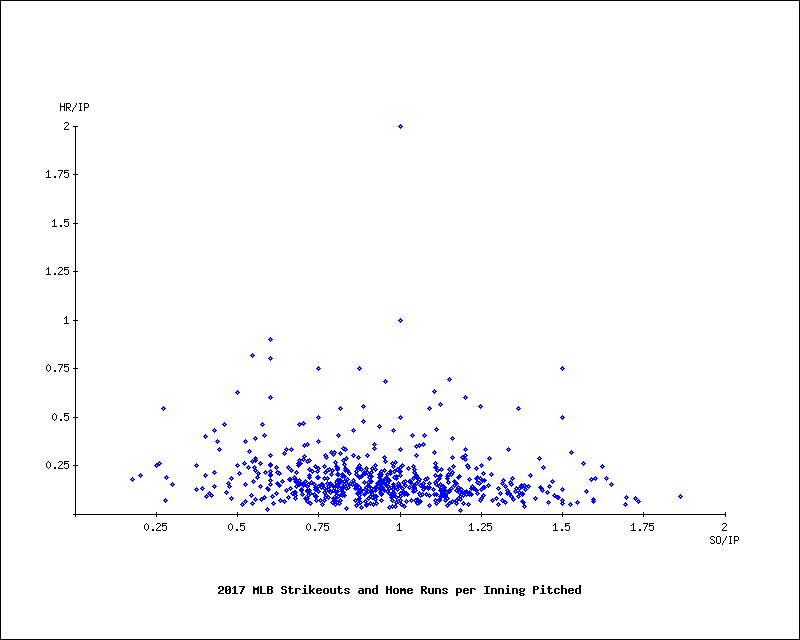
Strikeouts and home runs given up increase as pitchers throw for more innings, but the relationship between them has all but disappeared… there goes my sabermetrics career.
Wrap up
Chart::Plot is great for generating scatter or line charts when you have a lot of data. Its simple interface and sane defaults make charting easy.
However, as its style strings only contain four colors, you can only plot 4 different data series on a single chart. The chart text styling is hardcoded to a rather spartan style. And whilst it does give you access to the underlying GD object, it can be quite cumbersome to draw on the image pixel-by-pixel. Pie and bar charts are not supported, so you’ll need to use a different module for those. It isn’t a general-purpose charting library, it’s a specialized instrument. Everyone’s toolbox should have room for a few of those.
Tags
David Farrell
David is a professional programmer who regularly tweets and blogs about code and the art of programming.
Browse their articles
Feedback
Something wrong with this article? Help us out by opening an issue or pull request on GitHub
Site Map
License
This work is licensed under a Creative Commons Attribution-NonCommercial 3.0 Unported License.

Legal
Perl.com and the authors make no representations with respect to the accuracy or completeness of the contents of all work on this website and specifically disclaim all warranties, including without limitation warranties of fitness for a particular purpose. The information published on this website may not be suitable for every situation. All work on this website is provided with the understanding that Perl.com and the authors are not engaged in rendering professional services. Neither Perl.com nor the authors shall be liable for damages arising herefrom.